Background
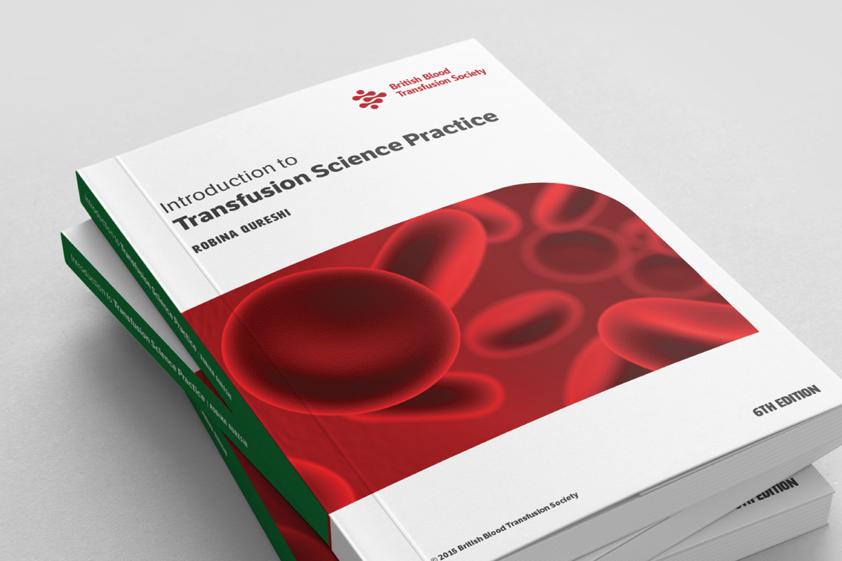
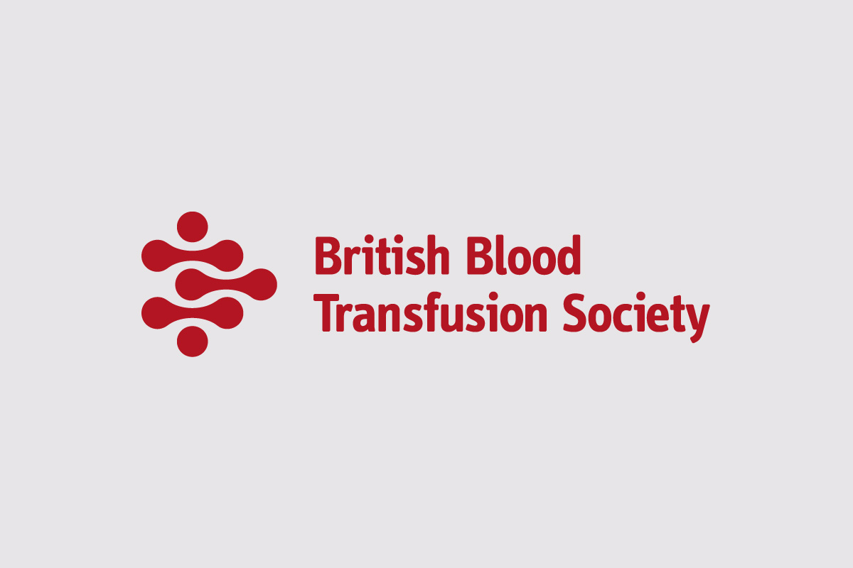
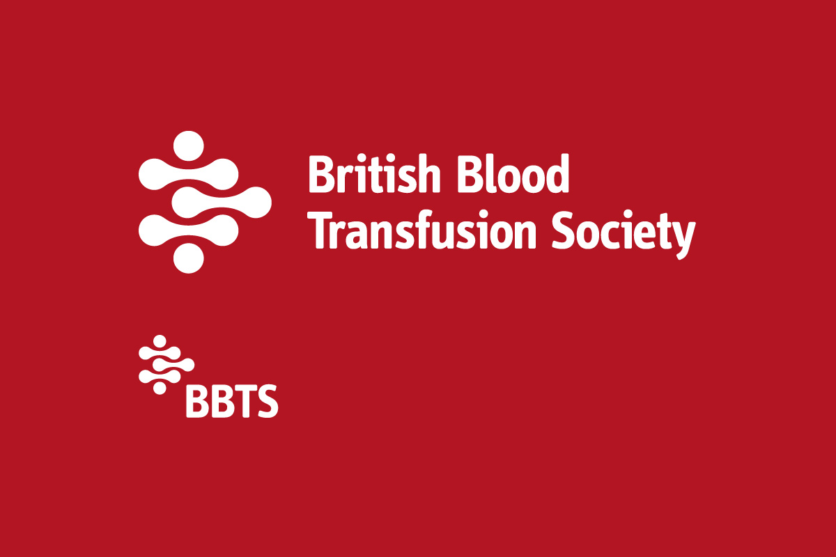
The British Blood Transfusion Society is a research organisation that seeks to be a central organisation to bring together all the research on blood transfusion. Their previous logo had been in place for over 30 years and had a dated look which was reflecting badly on the institution.
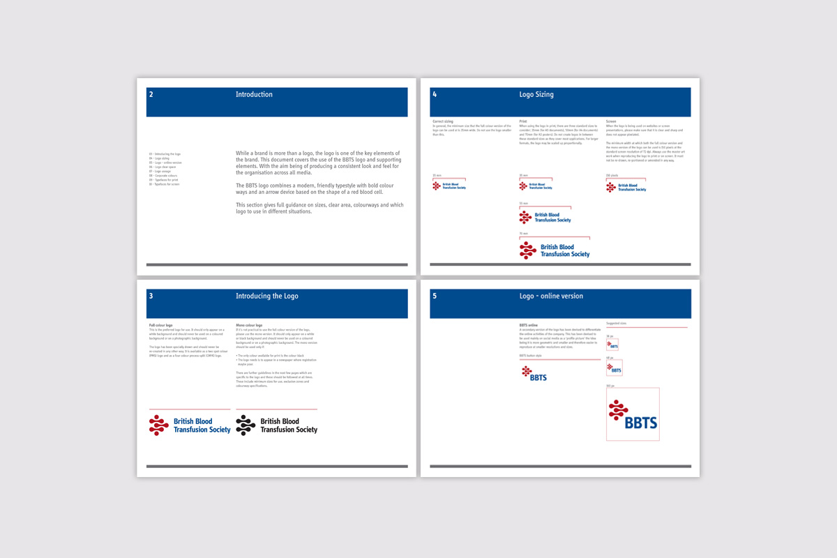
The society needed an identity system that would work as both a logo and icon so that it could be deployed in across various media such as traditional letterhead and print materials but also in across digital platforms such as social media where it could be used as an icon.
Strategy
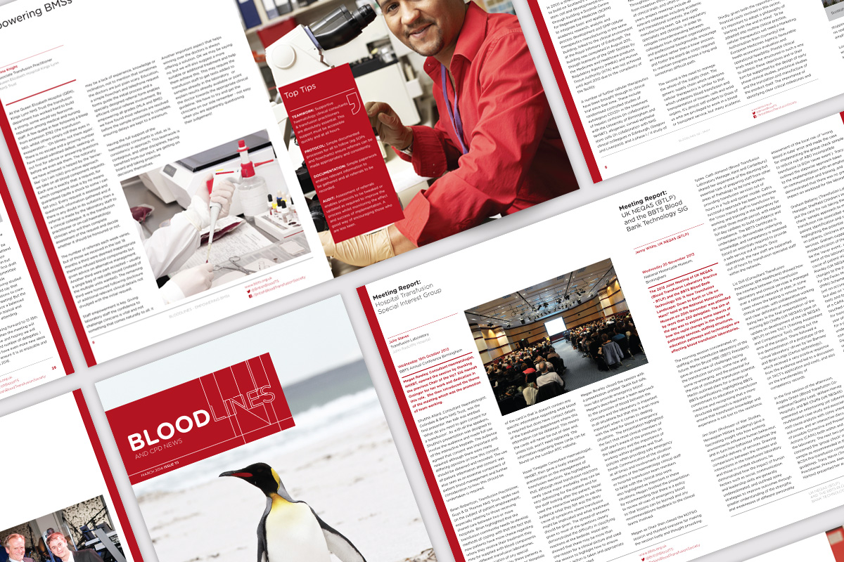
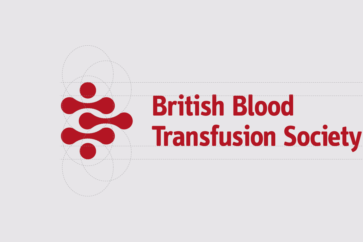
The starting point for the logo icon revolved around a red blood cell in profile. These shapes were then interlocked to represent different strands of research coming together and also created an arrow shape to represent movement. A new set of brand guidelines we put in place to make a cohesive identity that could also be deployed by other members of the organisation. The branding was also extended to the quarterly magazine the organisation publishes. Which was designed to integrate with the BBTS main brand.