background
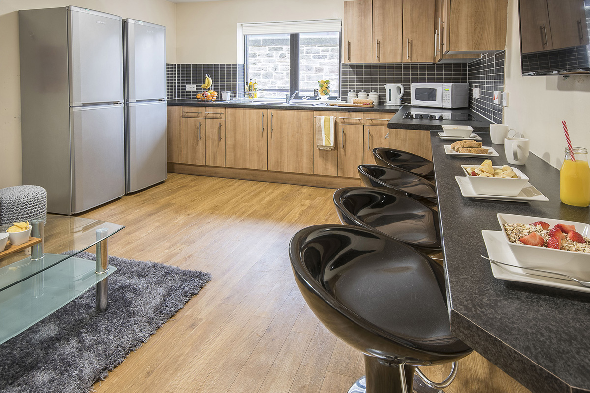
Mansion Student are a national student accommodation provider. They work as a real estate investment fund and go through cycles of acquiring accommodation modernising it, renting it out and then selling the property on. They have been trading since 2007 and have properties throughout the UK. Their original identity was dated and had a scruffy 'student' feel to it.


STRATEGY
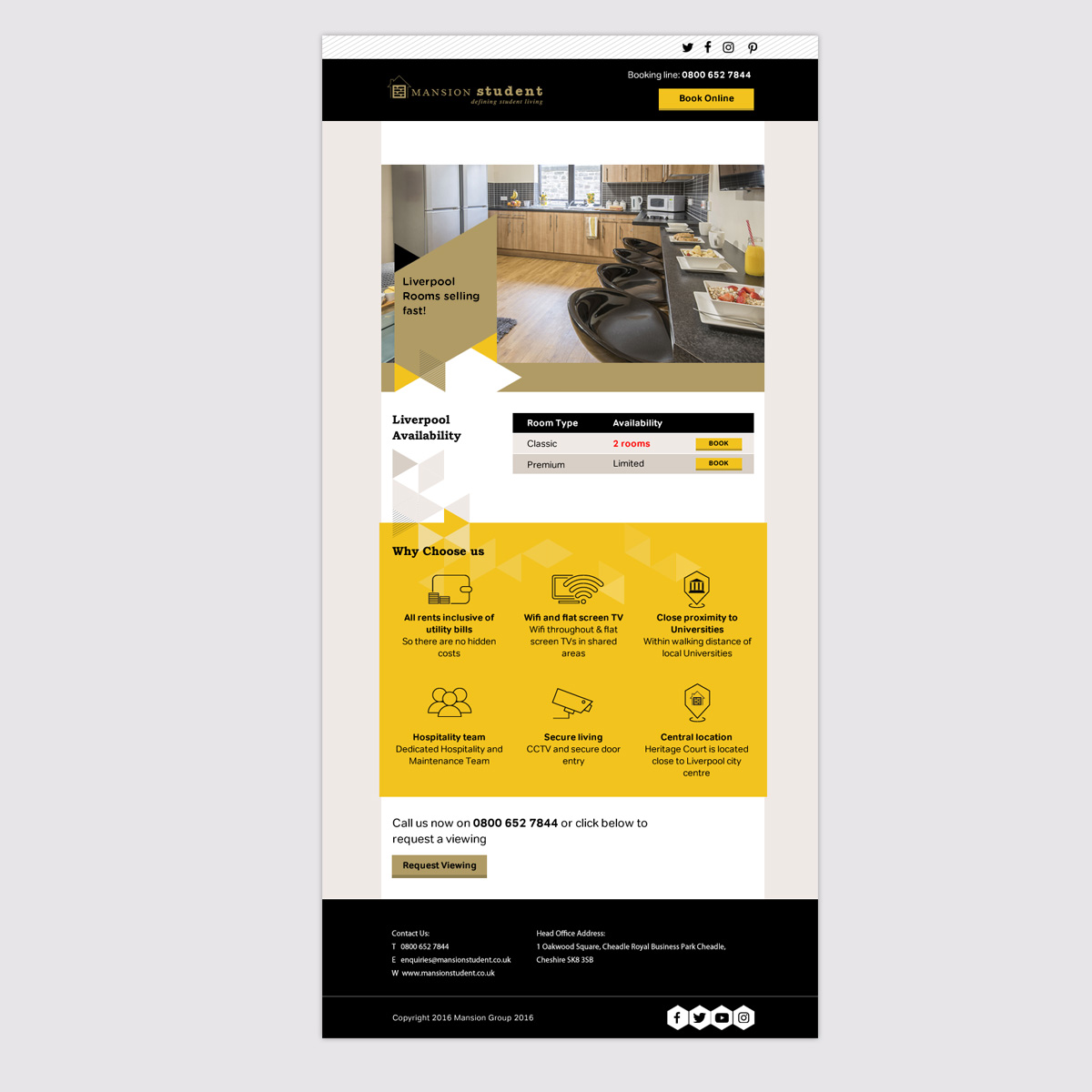
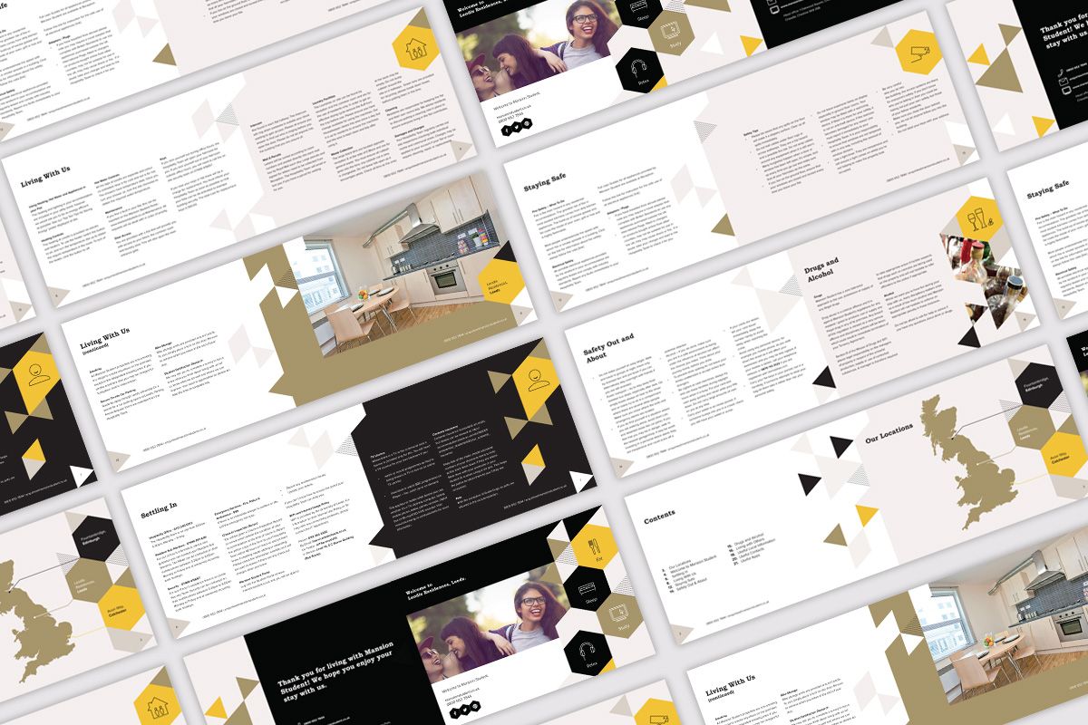
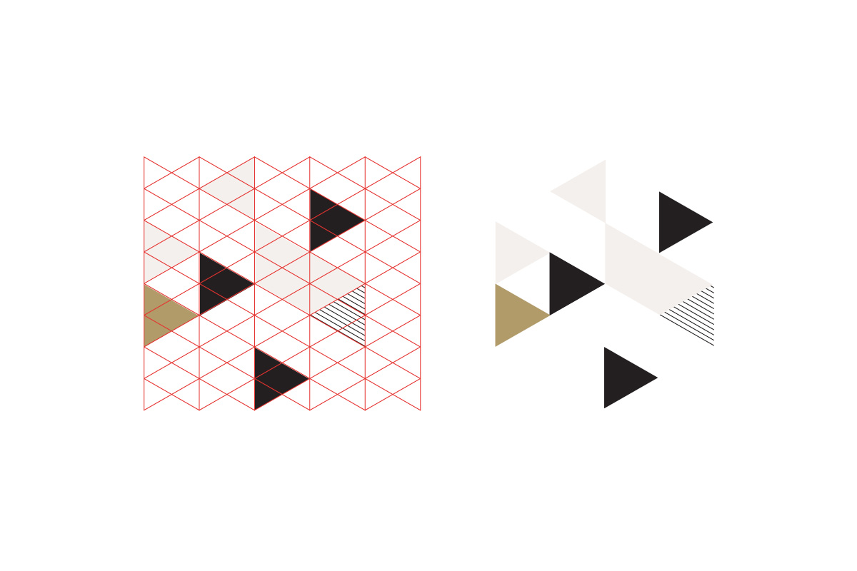
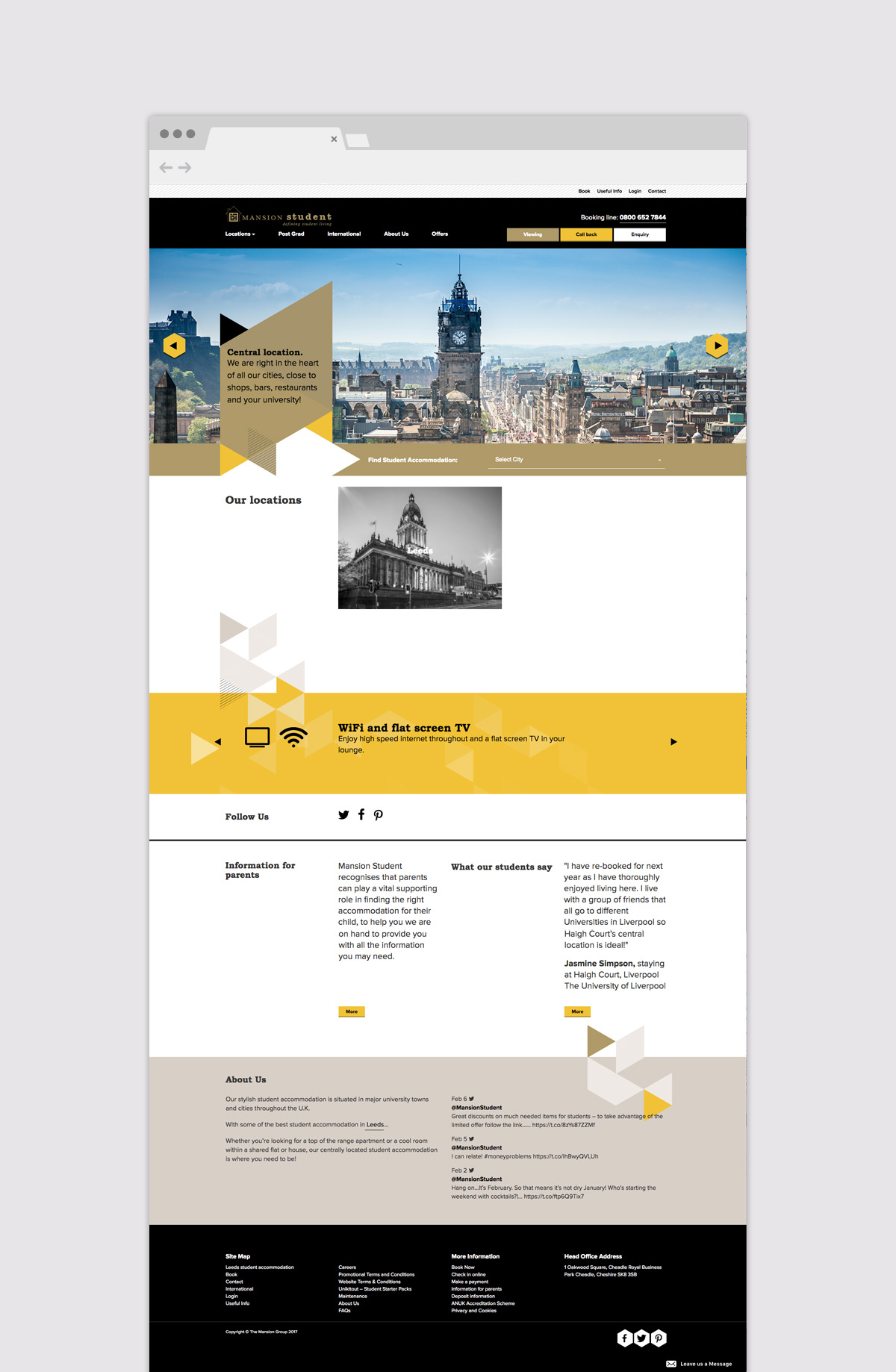
The overall look of the organisation had to be modernised. A triangular element was taken from the existing company logo - which we decided to keep as it was already recognisable in the market. This triangular shape was turned into an isometric pattern that was then deployed throughout all the company's marketing material. This could be used as a flexible pattern that can be adapted to suit various formats and media. The colour palette and fonts were also modernised and the overall identity moved away from the garish fluroscent type colour previously used.
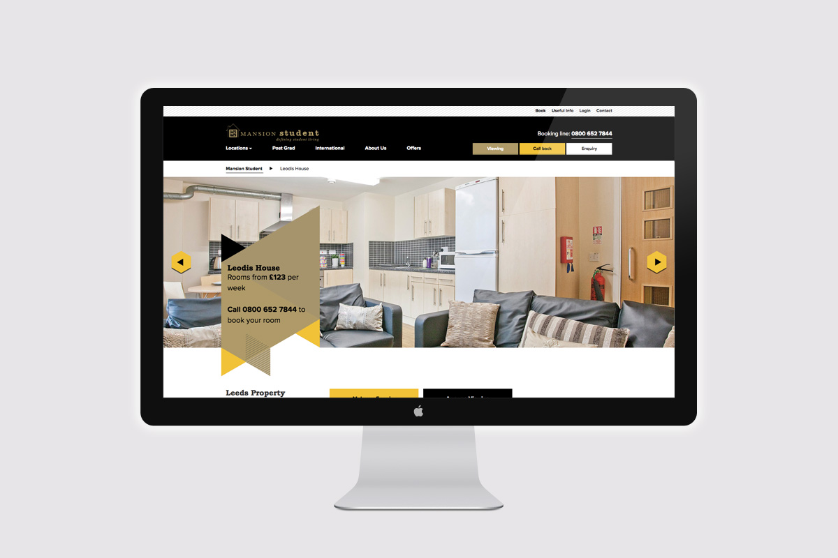
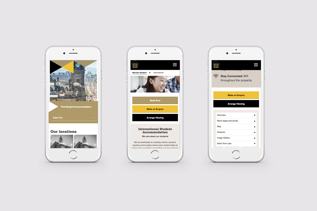
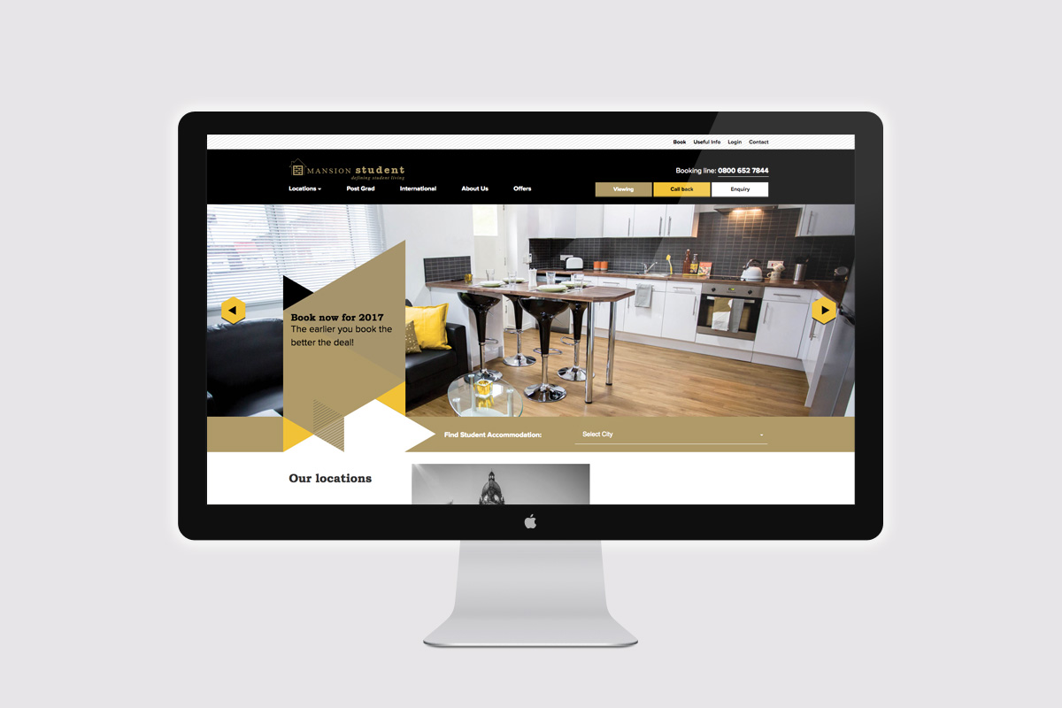
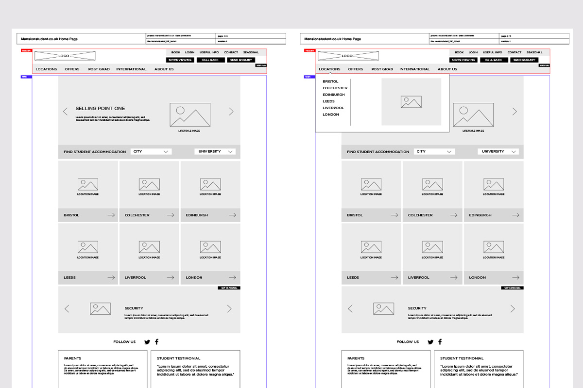
A responsive website was designed and built which also allowed user to make live bookings through the company's existing booking system.
